── Attaching core tidyverse packages ──────────────────────── tidyverse 2.0.0 ──
✔ dplyr     1.1.2     ✔ readr     2.1.4
✔ forcats   1.0.0     ✔ stringr   1.5.0
✔ ggplot2   3.4.2     ✔ tibble    3.2.1
✔ lubridate 1.9.2     ✔ tidyr     1.3.0
✔ purrr     1.0.1
── Conflicts ────────────────────────────────────────── tidyverse_conflicts() ──
✖ dplyr::filter() masks stats::filter()
✖ dplyr::lag()    masks stats::lag()
ℹ Use the conflicted package (<http://conflicted.r-lib.org/>) to force all conflicts to become errorsAE 11: Data Ethics in Visualizations - Suggested Answers
Go to the course GitHub organization and locate the repo titled ae-11-YOUR_GITHUB_USERNAME to get started.
This AE is due October 6th, at 11:59pm.
Packages
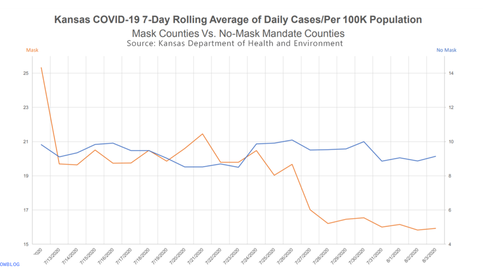
The following visualization was shared on Twitter as “extraordinary misleading”.

What is misleading about this visualization and how you might go about fixing it?
Data
kansas_covid <- tribble(
  ~date, ~"mask mandate", ~"no-mask mandate",
  "7/12/2020", 25.2, 9.8,
  "7/13/2020", 19.7, 9.2,
  "7/14/2020", 19.7, 9.4,
  "7/15/2020", 20.4, 9.8,
  "7/16/2020", 19.7, 9.9,
  "7/17/2020", 19.7, 9.6,
  "7/18/2020", 20.4, 9.6,
  "7/19/2020", 19.9, 9,
  "7/20/2020", 20.5, 8.5,
  "7/21/2020", 21.3, 8.5,
  "7/22/2020", 19.7, 8.6,
  "7/23/2020", 19.7, 8.5,
  "7/24/2020", 20.4, 9.9,
  "7/25/2020", 19, 9.9,
  "7/26/2020", 19.6, 10.1,
  "7/27/2020", 17, 9.6,
  "7/28/2020", 16.2, 9.65,
  "7/29/2020", 16.4, 9.7,
  "7/30/2020", 16.5, 10,
  "7/31/2020", 16, 8.8,
  "8/1/2020", 16.2, 8.9,
  "8/2/2020", 15.8, 8.8,
  "8/3/2020", 15.9, 9.1
)
We are creating the data set that we are going to use for this activity. Notice that we are using tribble. What does tribble allow us to do?
A tribble makes a row-wise tibble! Check out the help file.
Before we start making a new visualization, I was us to think critically about what our new visualization could look like. Relate this to how the data need to be structured.
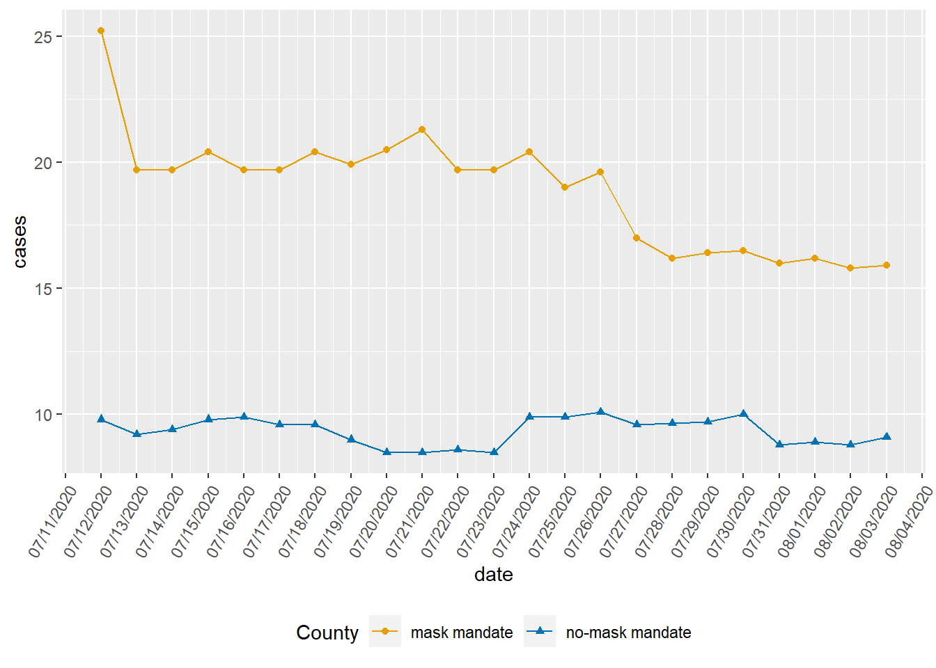
Demo: Update our visualization that more accurately (and honestly) tells the story.
kansas_covid |>
  pivot_longer(!date, names_to = "County" , values_to = "cases") |>
  mutate(date = as.Date(date, format = "%m/%d/%Y")) |>
  ggplot(
    aes(x = date , y = cases , color = County)
  ) +
  geom_line() +
  geom_point(aes(shape = County)) +
  scale_color_manual(values = c("mask mandate" = "#E69F00",
                                "no-mask mandate" = "#0072B2")) +
  scale_x_date(date_labels = "%m/%d/%Y", date_breaks = "1 day") +
  theme(axis.text.x = element_text(angle = 60, hjust = 1)) +
  theme(legend.position = "bottom")
What message is more clear in your visualization than it was in the original visualization?
There is evidence of less covid cases in counties that did not have the mask mandate.
Something to note:
When do we put aes in the geom vs the ggplot?
The difference is that when the aes are set in the original ggplot , they are inherited by any other geom’s that build on top of it. If you specify the aes only in a geom, it will only be used in that geom. If you use any specific aes in geom , they override the settings in ggplot .
