library(tidyverse)
library(palmerpenguins) #The data set name is penguins
Data Visualization II - Suggested Answers
Reminder: You can change html to pdf if you would like to make a pdf.
Let’s revisit the penguins data set.
Packages
Data
The dataset we will visualize is called penguins. Let’s glimpse() at it.
glimpse(penguins)Rows: 344
Columns: 8
$ species <fct> Adelie, Adelie, Adelie, Adelie, Adelie, Adelie, Adel…
$ island <fct> Torgersen, Torgersen, Torgersen, Torgersen, Torgerse…
$ bill_length_mm <dbl> 39.1, 39.5, 40.3, NA, 36.7, 39.3, 38.9, 39.2, 34.1, …
$ bill_depth_mm <dbl> 18.7, 17.4, 18.0, NA, 19.3, 20.6, 17.8, 19.6, 18.1, …
$ flipper_length_mm <int> 181, 186, 195, NA, 193, 190, 181, 195, 193, 190, 186…
$ body_mass_g <int> 3750, 3800, 3250, NA, 3450, 3650, 3625, 4675, 3475, …
$ sex <fct> male, female, female, NA, female, male, female, male…
$ year <int> 2007, 2007, 2007, 2007, 2007, 2007, 2007, 2007, 2007…Warm Up Exercise
There are 3 things wrong with the code below. Please fix the errors and document the changes.
Note: Try to solve the errors 1 at a time. Run the code after each fix, knowing you will get an error. This is a nice way to become more familiar with error messages!
penguins |>
  ggplot(
       aes(y = body_mass_g, fill = species )
       ) +
       geom_histogram(binwidth = 300, alpha = .5)
We added a pipe, , and a +; we often got the unexpected symbol error telling us roughly where the error was occuring
Warm Up Exercise
Below are two sets of code that attempt to create a scatter plot between flipper length and bill length with blue dots. Let’s assume that blue is my favorite color, and I want all the points to be colored blue (don’t use color without a purpose, this is just a teaching moment).
Please identify what is different about each set of code. Next, run the code and identify the difference in each plot. Next write down the reason why the plots are different based on the code.
penguins |>
  ggplot(
    aes(x = flipper_length_mm, y = bill_length_mm, color = "blue")
  ) +
  geom_point()
Warning: Removed 2 rows containing missing values (`geom_point()`).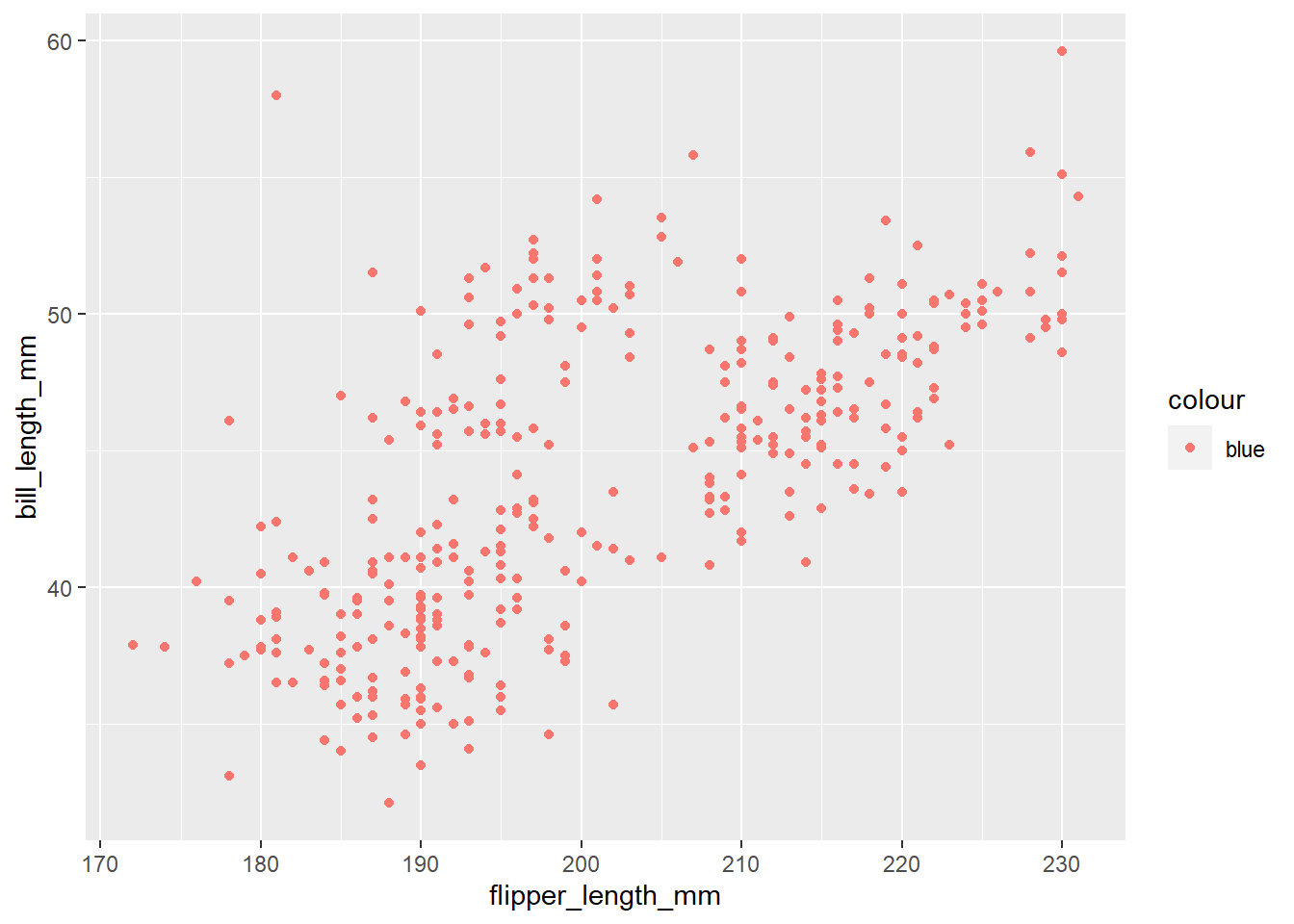
penguins |>
  ggplot(
    aes(x = flipper_length_mm, y = bill_length_mm)
  ) +
  geom_point(color = "blue")
Warning: Removed 2 rows containing missing values (`geom_point()`).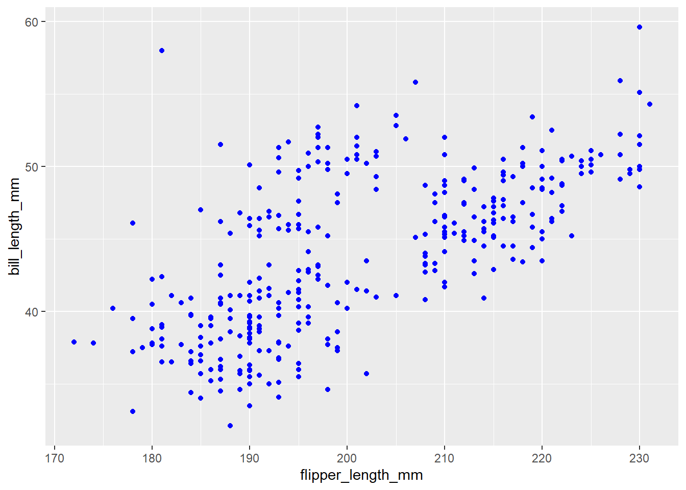
Anything that we want to change based on a variable in our data set goes into the aes. If we want to change something that has nothing to do with our data (e.g., turning points blue) we do not put this in the aes.
Now would be a good time to render, commit and push!
Start Activity
Last class, we made a histogram, boxplot, and multiple histograms in the same plot. Let’s continue with this activity.
Two variables
Analyzing the relationship between two variables is called bivariate analysis.
Create visualizations of the distribution of weights of penguins by species. Note: aesthetic is a visual property of one of the objects in your plot. Aesthetic options are:
- shape
- color
- size
- fill
- Make a histogram of penguins’ weight where the bars are colored in by species type. Set an appropriate binwidth and alpha value.
penguins |>
  ggplot(
       aes(x = body_mass_g, fill = species )) +
       geom_histogram(binwidth = 200, alpha = .5)
Warning: Removed 2 rows containing non-finite values (`stat_bin()`).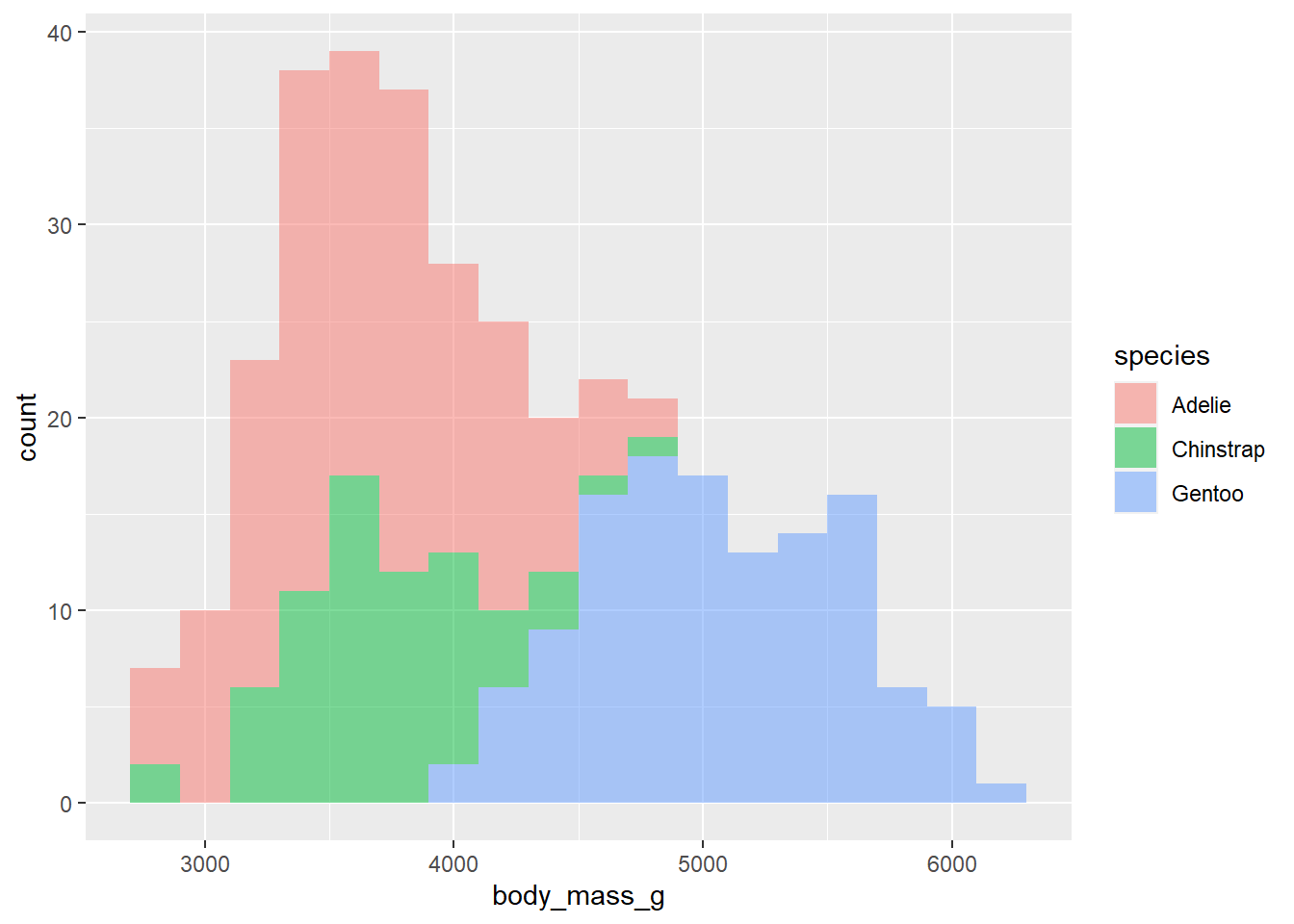
What does binwidth do? What does alpha do?
binwidth controls the size of the bins; alpha controls the transparency of the graph.
- What if we don’t want the overlap? We can use
facet_wrapto split the histograms apart! This function takes the name of the variable you want to split by, and how many cols/rows you want your plots to show up in. Note: the syntax for this function is~variable.name. Run ?facet_wrap in your console to see the name of the row and column arguments withinfacet_wrap.
penguins |>
  ggplot(
       aes(x = body_mass_g, fill = species )) +
       geom_histogram(binwidth = 200, alpha = .7) +
       facet_wrap(~species, nrow = 3)
Warning: Removed 2 rows containing non-finite values (`stat_bin()`).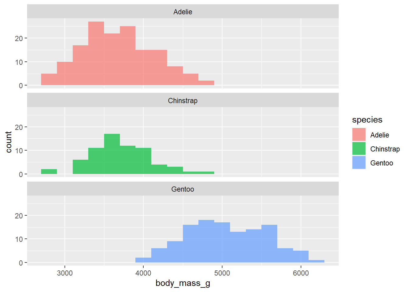
In 1-2 sentences, describe what you see in the plot you created.
We see that these histograms look fairly symmetric and that the gentoo species tends to be heavier than the others.
- Now, lets make a scatter plot between
bill lengthandbill depth. Color the points by species and shape the points by island.
penguins |>
  ggplot(
    aes(x = bill_length_mm, y = bill_depth_mm, color = species, shape = island)
  ) +
  geom_point() +
  facet_grid(species ~ island)
Warning: Removed 2 rows containing missing values (`geom_point()`).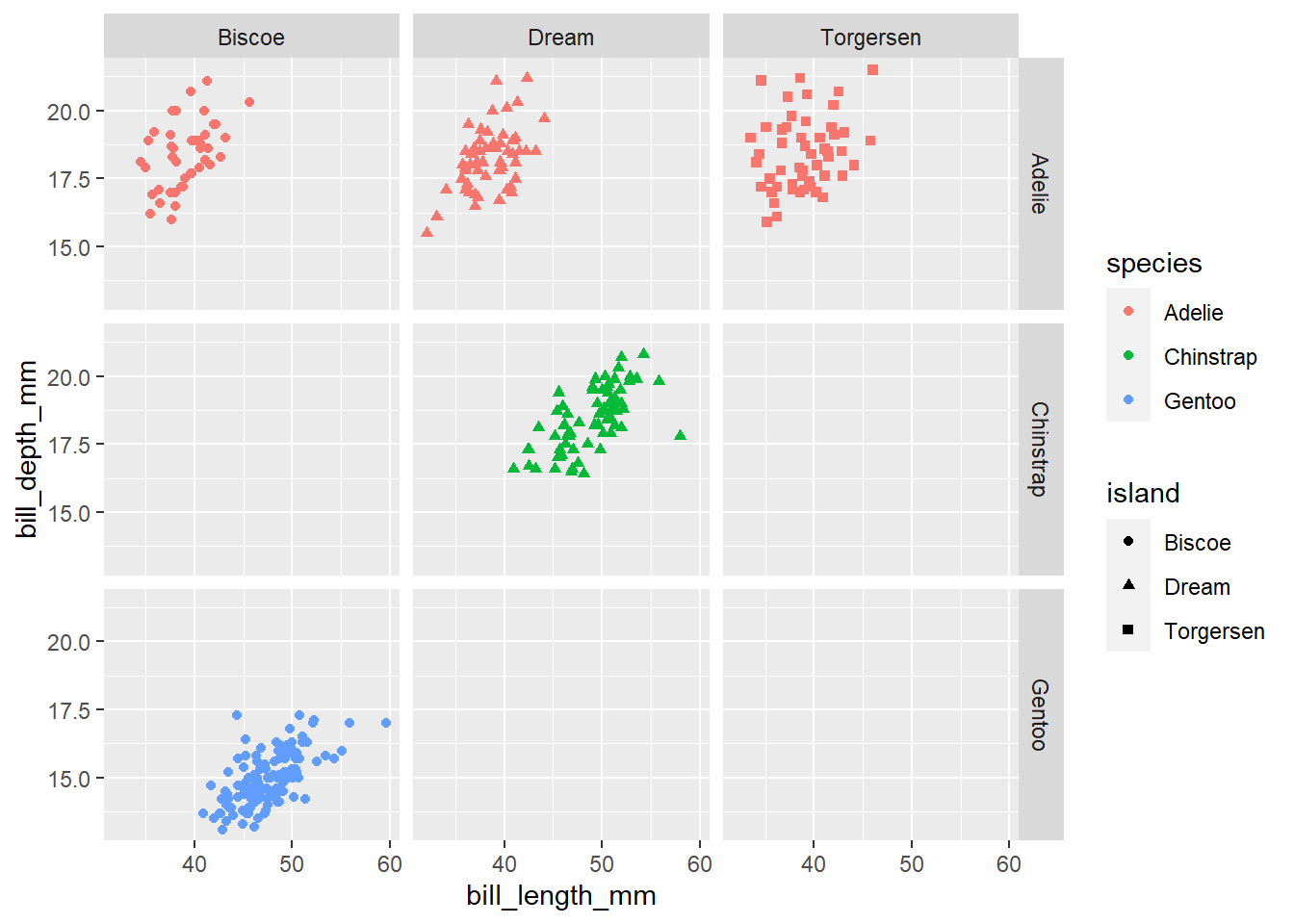
If you want to make a series of plots based on more than 1 variable, you can use facet_grid. For more information on the difference, please reference the following: https://stackoverflow.com/questions/20457905/whats-the-difference-between-facet-wrap-and-facet-grid-in-ggplot2.
Add the following code to the above plot facet_grid(species ~ island)
- Create side-by-side boxplots to compare body mass across species. Also, fill in each boxplot with a color for each species.
penguins |>
  ggplot(
    aes(x = species, y = body_mass_g, fill = species)
  ) +
  geom_boxplot() +
  labs(title = "Body Mass by Species",
       subtitle = "for penguins",
       y = "Body Mass in Grams",
       x = "Species") +
  theme(legend.position = "none")
Warning: Removed 2 rows containing non-finite values (`stat_boxplot()`).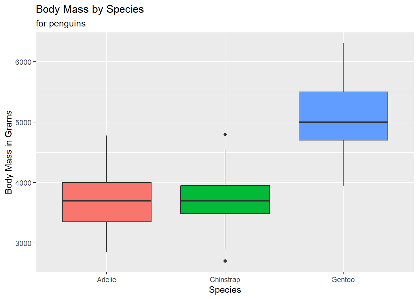
We need to make sure that we include an informative title, axes should be labeled. We can do that using the labs function. Let’s change the code above to do so by explore the labs function and the following arguments.
- title
- subtitle
- x
- y
- caption
- arguments in your aes!
Do you suppose we need a legend? Why or why not?
Nope! This information is already given to us on the x-axis.
Let’s use the function theme to turn off the legend (for practice). Theme (different from adding a color theme) allows us to control a lot of the visual and text features of our plot. Please see the following reference here: https://ggplot2.tidyverse.org/reference/theme.html
Add the following code to the above plot to turn off the legend: theme(legend.position = "none")
- We need to think critically about color when thinking about creating visualizations for a larger audience: https://ggplot2.tidyverse.org/reference/scale_viridis.html
We will do more with colors throughout the semester. Think about this is as our first introduction. We can create a colorblind friendly pallet using scale_colour_viridis_d() or scale_colour_viridis_c() depending on the type of variable we are working with. Below, comment the code below to describe what it’s doing:
p <- penguins |>
  ggplot(
    aes(x = body_mass_g, y = bill_length_mm , color = species)
  ) +
    geom_point()

p
Warning: Removed 2 rows containing missing values (`geom_point()`).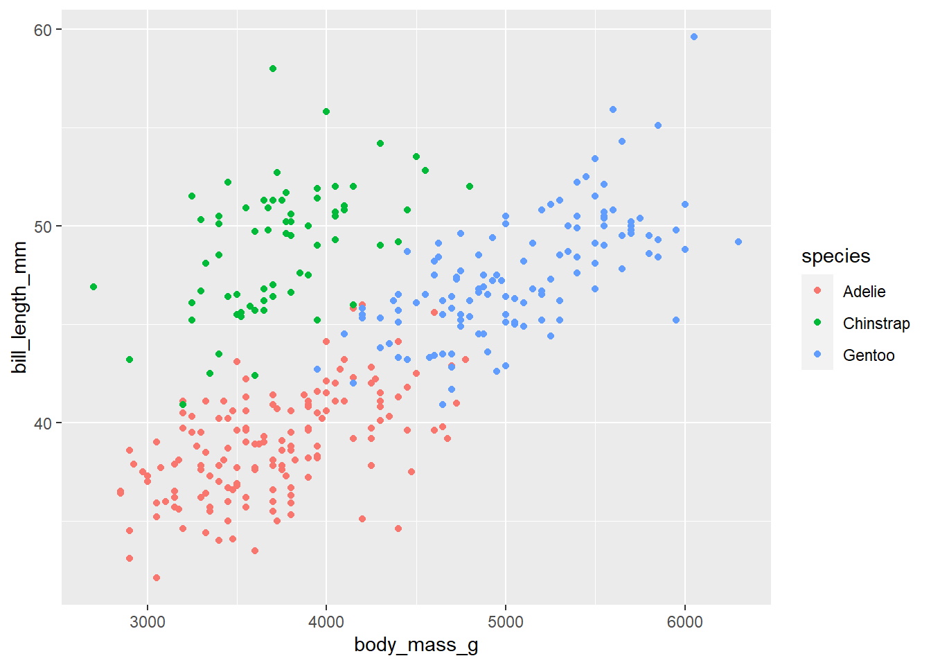
p + scale_colour_viridis_d()Warning: Removed 2 rows containing missing values (`geom_point()`).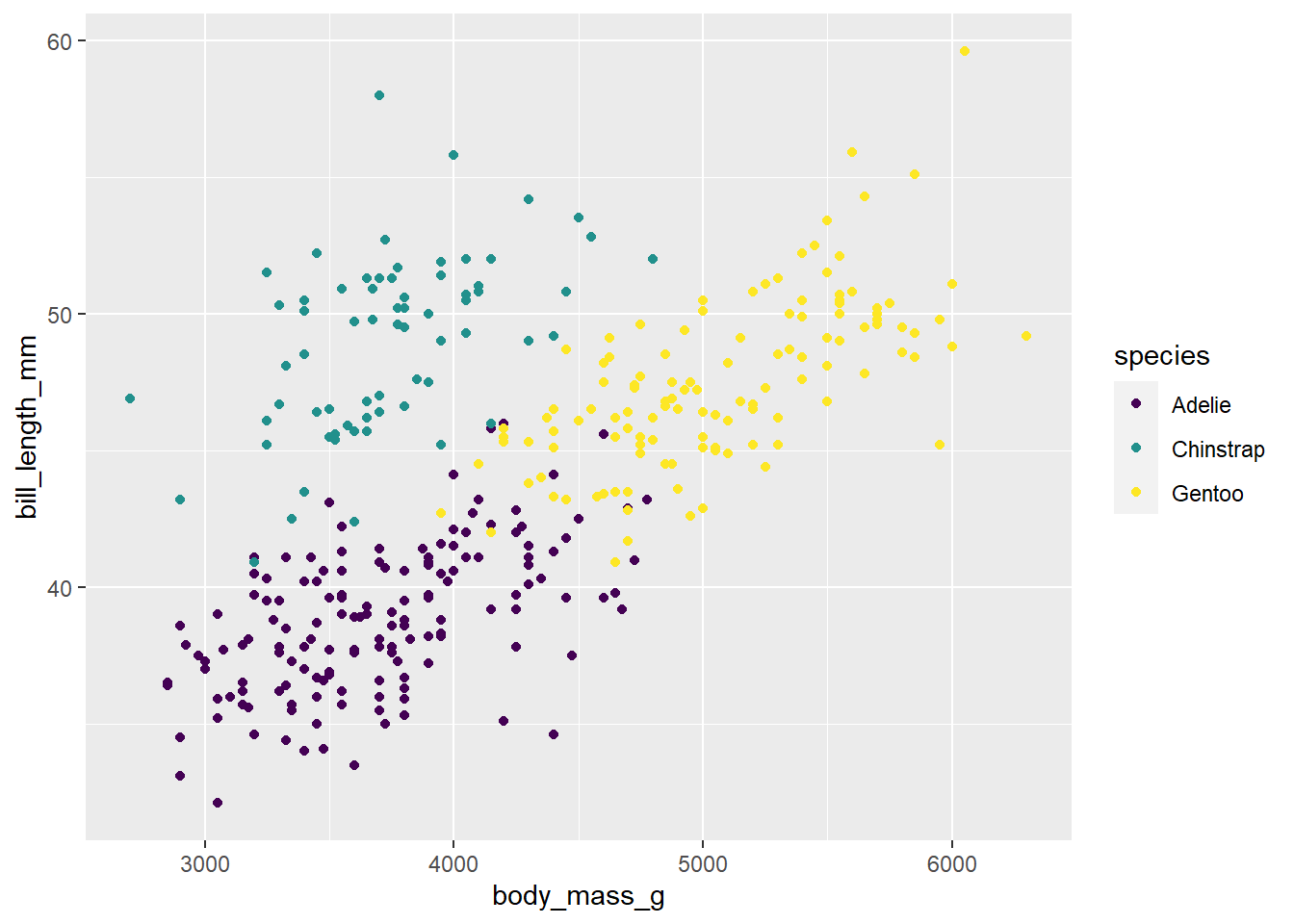
# We can also simply add scale_colour_viridis_d to our pipe like we are accustomed to.

# The above example with p was to emphasize what the <- does, and to show an alternative way of plotting (of which you will see often in help files)

penguins |>
  ggplot(
    aes(x = body_mass_g, y = bill_length_mm , color = species)
  ) +
    geom_point() +
  scale_colour_viridis_d()
Warning: Removed 2 rows containing missing values (`geom_point()`).
Recreate Plot
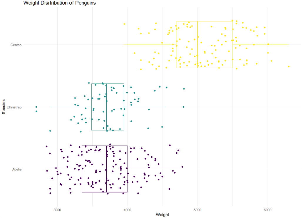
- Let’s use multiple geoms on a single plot. Be deliberate about the order of plotting. Our task is to recreate the following image below. Hint: This plot uses
theme_minimalandscale_color_viridis_d(option = "D").
Hint: To make a scatterplot, we use geom_point. This is asking to space out or jitter the points over top the box plot. Our helpful link is a good reference for this: https://ggplot2.tidyverse.org/reference/
penguins |>
  ggplot(
    aes(x = body_mass_g, y = species, color = species)
  ) + geom_boxplot() +
  geom_jitter() +
  scale_color_viridis_d() +
  labs(title = "Weight Distribution of Penguins",
       x = "Weight",
       y = "Species")
Warning: Removed 2 rows containing non-finite values (`stat_boxplot()`).Warning: Removed 2 rows containing missing values (`geom_point()`).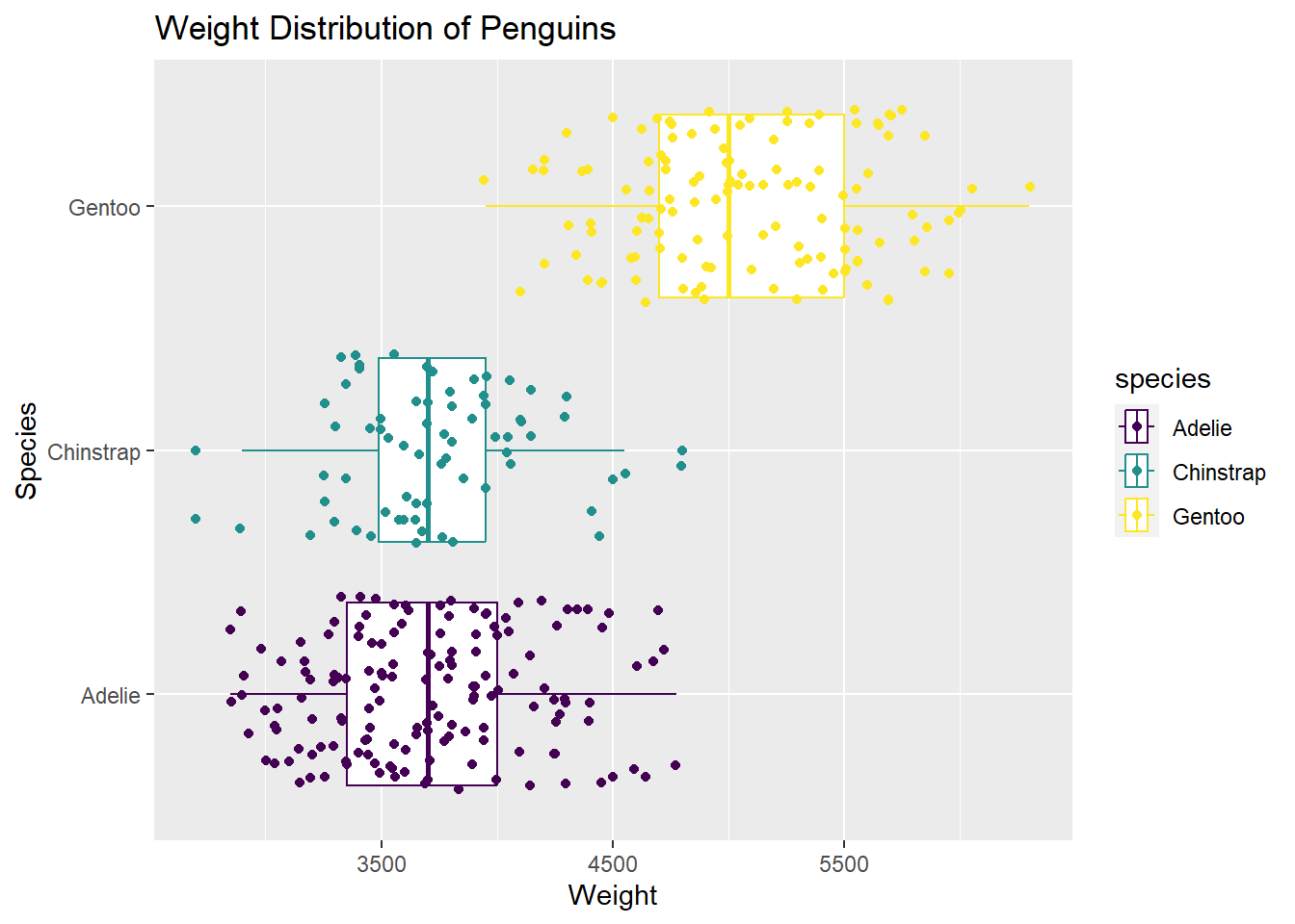
Optional
Make your own plot! Revist the geoms page here: https://ggplot2.tidyverse.org/reference/
