Communicating data science results effectively
Lecture 26
Dr. Elijah Meyer
Duke University
STA 199 - Fall 2023
2023-11-28
Checklist
– Peer Review Survey is live (see Slack for details)
– Reminder: HW-6 due Dec-8th; Found on bottom of schedule
– Project Presentations next Wednesday
– Project write-up and final repo due Dec 8 - you will lose access to your repo at this time
Instructor Evaluation
Please take 10-minutes to fill out the instructor evaluation
Elijah:
– “What things worked well? What constructive feedback do you have?”
– “I take these seriously and will read them over break”
Lab Wednesday
– Be present
– Give constructive feedback to your peers
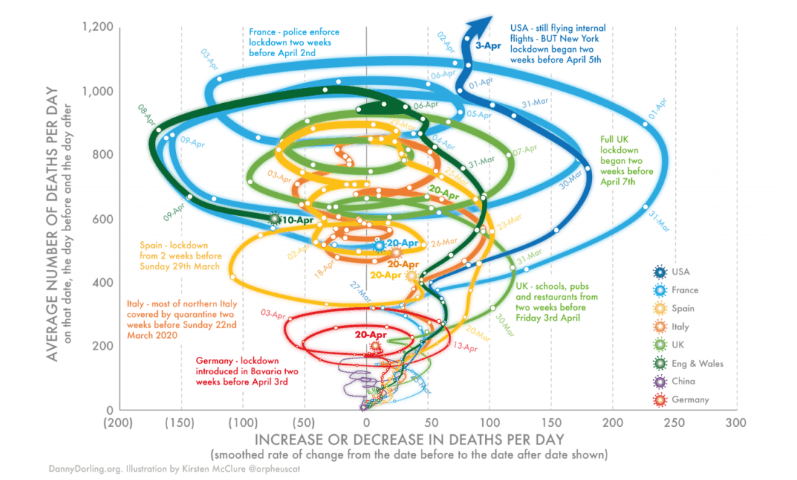
What’s going on in this plot?

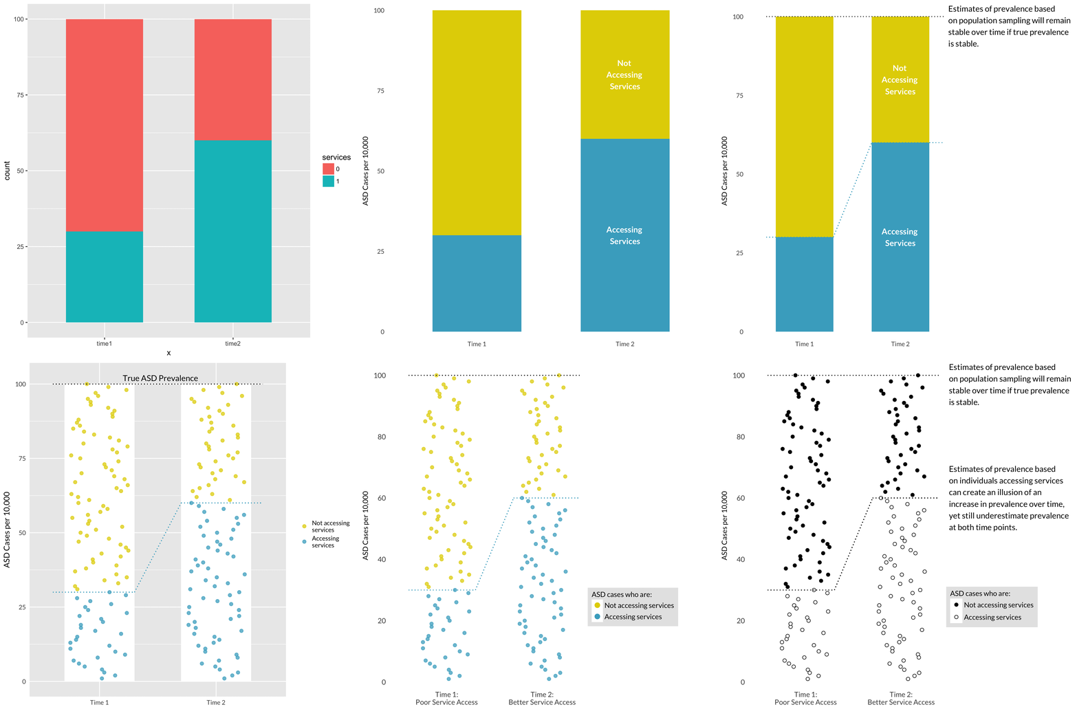
Take A Sad Plot & Make It Better

ae-26

Recap
- Represent percentages as parts of a whole
- Place variables representing time on the x-axis when possible
- Pay attention to data types, e.g., represent time as time on a continuous scale, not years as levels of a categorical variable
- Prefer direct labeling over legends
- Use accessible colors
- Use color to draw attention
- Pick a purpose and label, color, annotate for that purpose
- Communicate your main message directly in the plot labels
- Simplify before you call it done (a.k.a. “Before you leave the house, look in the mirror and take one thing off”)
